Sunday, February 6, 2011

Color and Lighting

In class on Thursday during the lighting lessons, I thought it would be good to make a flag on a flagpole with colored spotlights on it and waving in the wind, so I could explore making more fluid shapes and some movement-related positions in the "fabric" and see how colors blend in Maya. Using the US flag seemed like a good idea more for the primary colors and easy shapes than for any emotional content it might elicit in the viewer.

I figured I'd make a thin rectangle with 13 horizontal subdivisions for the stripes and a bunch of vertical subdivisions so I can put some non-flat positioning into the flag. Coloring the horizontals should be trivial, and I could apply a jpeg with stars on a blue field to the upper left field, I figured. A few spotlights on the flag, a directional light to illuminate the scene, and a couple of buildings in the background for the flag to cast shadows onto and I'd be set.

I built the basic shapes, then worked on the flag, applying a red Blinn texture to the red stripes and a slightly off-white Blinn to the other stripes. I removed the area I wanted blue and used Mesh>Fill Hole to put one big blue (Blinn) square in the upper left corner of the flag. A couple of colored spots and a directional light, save it and render it. Everything so far worked as I expected; it looked okay. So far, so good. I saved it and closed it up.

When I opened it, several of the flag elements were the wrong color, despite the Attribute Editor telling me the proper texture was applied. I rendered it to make sure they were not just a display glitch, and sure enough, they rendered the wrong color. I tried reapplying the correct texture/color, with no effect. In the process, I noticed there were four subdivisions on the back of the flag that had turned blue; when I tried to apply the whitish Blinn to them, all the white stripes turned blue. After a few unsuccessful tries at fixing both of those problems, I resolved to go ahead with the flaws unfixed, for the sake of my blood pressure.

Here is a render, from the saved file of my first session with this model:


Ironically, it worked this time (after I gave up on it). 

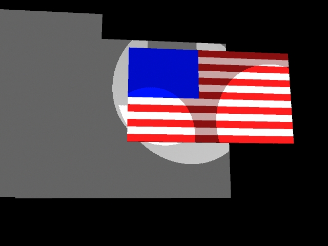
The model, however, is still badly flawed. Here's a screen shot of the model that rendered as above. Note the wrongly-colored parts of the bottom red stripe:

Go figure.


Then I tried to follow the instructions in Miles's instructional videos, but couldn't figure out why we were importing an image into the image plane, so I tried to see what the heck an "image plane" was, but Maya's Help Files never tell us. I couldn't see how to bring up the Attribute Editor for the Image Plane except when importing a graphic into it, which meant abandoning changes and reopening the saved version until it did what I wanted; associated a UV map (a couple of stars on a blue field) with the blue rectangle. When I finally got the rectangle to acknowledge the stars, the white stripes had again turned blue -- all, that is, but the parts of the stripes that had gone checkerboard blue and red, and the missing faces in the bottom row. And the stars did not appear in the blue rectangle, as i thought they should. Here is a screen shot of that:

Mangled Flag.jpg

In addition to the color issues, many faces from the bottom row went missing. You can't really see it in the above picture, so here it is angled so you can see what happened to the bottom row:

Mangled Flag Angled.jpg

I wondered what could possibly have happened. Whatever it was I was sure I hadn't done anything that should have led to that result. 

I put it away and wrote this in frustration. 


It's pretty clear to me now that Maya and I are never going to get along.

Sunday, January 30, 2011

UVs with a Basic Shape

I had three goals with this assignment: Learn how to do UVs, learn about smoothly-beveled edges, and figure out how the UV Texture Map chose its arrangement of rectangles.

I arranged the dots for the faces in a jpg file purposely in the wrong order (opposite faces add up to 7 in any standard pair o' dice), so I would have to learn how to map the faces to different areas of the jpg file, and purposely incorrectly arranged the dots on the face with 2 so I would learn about editing the UVs post-mapping.

I thought a pair o' dice would give me opportunity to try out all those things I set out to learn without making it too difficult to navigate through the UV-rectangle-mapping maze.

I was wrong. It was much too difficult. I gave up on how to smooth out the corners and edges, putting in a token flat bevel and shading to suggest it. I did not succeed in finding out how the UV automatically updates after post-mapping editing; note the two dots on the 2 face vertically aligned, where they should be diagonally aligned as they are in the jpg file.

Here it is, ready to hang from your virtual rear-view mirror:


The difficulty mostly sprang from Maya's rats-nest of an interface. What a nightmare! I ended up pulling my hair out and screaming at it several times. Even Windows knows better than to display a button for everything the program does all the time, even when the feature is not active. Even Microsoft Office knows better than to make the same commands do different things if everything looks like it should be doing the same thing it did a minute ago. Some features, such as the difference Boolean, are completely unreliable, working after some attempts but not others.

Maya crashed a lot. I now have some kind of handle on it: When I made a menu choice that appeared not to have done anything, then chose from the same menu again, Maya would inevitably crash; any unsaved changes became lost work. I found it particularly irritating when I would tell it to render; it would try to save the scene, and would not accept a render choice until that very helpful dialog box about the file having been worked on by the student version of Maya had been dismissed, despite any attempt to dismiss it causing a fatal beachball.

We, the users, should hold out for better interface practices than this, but I fear the majority of the world, browbeaten into using Microsoft products and enticed into using Playstation (without question the worst interface I have ever seen for a digital device of any sort) has been trained to expect no better. At the very least, the Mac versions of programs should conform to the still-revolutionary Human Interface Guidelines that Apple created for their developers, which advises (among many other things Maya should be paying attention to) that, for example, an unusable feature should be either grayed out or not taking up screen space.

The things I need to learn still from this lesson:
1. I could not figure out how to quantify the Cut Faces, Split Polygon and Edge Loop tools to give me the precision I wanted.
2. My vertices are still not snapping. This is a very useful function, but it somehow got disabled and I have no idea how to get it back, even though I've been shown how.
3. I could not get the trick of getting the object's surfaces to automatically update when the UV document is edited in Photoshop.
4. And, of course, rounding off the edges. There must be a feature that does that. In fact, I probably saw this feature when a cylinder turned into a jellydonut shape when I unknowingly typed some key on the keyboard. I figure there's a way to take control of whatever that was and use it to round off an object's edges.

Thursday, January 27, 2011

Project 3 Reflexive Essay


Here is a swatch of weathered limestone from a royalty-free site. It struck me as being similar to the NASA pictures of Mars from when they were trying to figure out whether Mars has enough water to support life as we know it.
http://www.public-domain-image.com/textures-and-patterns-public-domain-images-pictures/rock-stone-texture-public-domain-images-pictures/weathered-limestone-texture.jpg.html


I think it was with "The Mummy" that I first saw the power of digitally mapping a texture such as sand to a surface. It enables the writers to use a favorite comic-book trick: creating a bad guy by personifying an aspect of nature, here the predominant force of the desert.


In this poster of our friendly neighborhood Spider-Man and his not-so-friendly counterpart we see an interesting texture (especially noticeable in the legs) that either is or digitally mimics the fabric Tobey Maguire and his stunt-men wear when they portray Spider-Man, showing the filmmakers' concept of the material Peter would have chosen for his Spidey-suit.


Project 3

Here is my render of the Kiev gate after applying a variety of textures. For the vertical supports on the sides and the bar across the main entry, I used the built-in wood texture. For the cross at the pinnacle of the building, I used phong to give it a little shine, shaded it a bit purple and made it rather bright. 

For the other areas filled with brick and logs,  I found some material swatches at backgroundsarchive.com, filled a big window with those I chose and took a screenshot to use as a UV, then applied them to the objects in the image. For the front archway and the tall spires, I chose a brick design, took it into Photoshop to give it the right tone and applied it. For the second-story ramparts, I found a stacked-log swatch and toned it properly in Photoshop, then applied it to the appropriate objects.


I wanted to apply a texture to the sloping planes. When I tried to apply a texture to a face, rather than to an entire object, it didn't take.
I was surprised when I saw how the bricks mapped to the shapes I built the building from. I'll need to figure out how to straighten that stuff out.

There is still much to do, but I'll leave it at this for now and work on it more on the weekend.

Monday, January 24, 2011

Project 2 Reflective Essay

I'm not sure I have the verbal tools to talk about the topic at hand, but I'll give it a shot:

In this image, the human scale of Batman in the foreground and the widows' walk fence at his feet show the scale of the buildings in the background. The mists show the distance to the buildings, which emphasizes their size.
The background's warm browns underlit with reddish glow contrast with, and at the same time model (note the shoulders and cape edge) the foreground's contrasting blacks. The flames from the background chimneys provide a different sort of contrast with the misty, shadowy buildings than the foreground snow's contrast with the blacks, providing a sort of metacontrast (the mist/fire contrast in the background contrasting with the snow/shadow contrast in the forground). Midground is firmly established by a more human-scale, dark brown building with a contained dark/fire contrast in the windows softened a bit by the mists.
The black line across the bottom leading to the human figure emphasizes the flow of the eye across the picturefrom the top center tallest building's lights, following the rain to the midground building and on to the Batman, placed at the lower right to become the sympathetic center of focus.
The widows' walk fence serves as a repoussoir.

http://lifesessions.com/wallpaper_free_desktop/images_1680_1050/istanbul_blue_mosque.jpg

IN this Istanbul blue mosque, the warm amber light on the surrounding midground straight walls contrast with the grayer background's oval structures; the spires (mostly midground) are the very antithesis of the building's domed roofs. The foreground rooftops and trees establish scale for the entire picture. The foreground obelisk on the left balances the background buildings on the left; the spires interspersed through the image show depth.

http://www.portlandbridges.com/00,DREB0CRW07046,23,0,1,0-portland-oregon.html

This Portland cityscape's foreground silhouette repoussoir frames the city in the midground with the misty Mount Hood in the background. The stone gray and brick colors mottling the city contrast with both the long greens and blacks of the foreground and the monolithic white shape emerging from the background's broad blues. The human scale in the foreground emphasizes the tallness of the midground buildings which in turn blend into a dark strip that reveals the distant hugeness of the mountain.

Project 2

Okay. I had quite a bit of trouble getting Maya to run on my computer, which was necessary for me to work on the assignment. After many days of sweating it out with Autodesk tech support, I got it working, so now, finally, I can post my response to Project 2. To do so, I went into my rough build of the golden gate of Kiev, and found it was not what I would have done if I'd known then what I know now, so I redid it. I used the opportunity to learn about quantifying the measurements using Maya, and was able to be much more precise in lining up the objects I was working with.

Then I tried applying some "difference Booleans" to the Mesh (something I never thought I'd be saying, and am not sure I should be admitting here) and had some success with the main archway, but when I tried to use the same techniques for other windows, I couldn't get it to work. Any archway-shaped object I created ate up the entire shapes involved rather than "differencing." I'm still not sure exactly why I couldn't get it to work; I really wanted to get those windows in place.

The building is astonishingly geometric, so there was no real modeling I could usefully do, though I did want to put in some mossy vegetation on the angled faces, but I ran out of time before I conceived of how to do so with the tools I know.

I threw in some color to give it definition, used a few wood textures to try out the textures function, adjusted the camera for the view I wanted and rendered a picture of it. Weird color choices, but when I've applied UVs, it shouldn't matter.

Here it is:

It really needs the windows!

Tuesday, January 11, 2011

Project 1: The Block Buildings

I was unable to figure out how to get a camera view, so here are screen shots of my buildings:

My Transamerica Tower


My Washington Monument


My Kiev Gate


Project 1 reflections

First assignment appeared to be twofold, one fold concerned with art concepts such as "How does one capture 'bigness' in a 2D image," and the other fold being the technical, this one about how to work in a 3D emulation environment to create the desired 2D image.

I undertook it with considerable trepidation, as it would involve exploration of a software interface I had previously found frustratingly opaque. Nonetheless, I needed to pull back the veil, so I plowed in, reinforced by Miles's reassurance that he understands that software knowledge is an "oral tradition."

I sought images in which I expected the concept of "bigness" would be strongly reinforced. I sought them mostly where I knew I would find them, in an area in which I am very comfortable: mainstream comics. I threw in a few architectural examples, because that seemed to be the thrust of the assignment, and because their building blocks are so much simpler than the humanoid shapes that are at the center of mainstream comics.

I'd always been interested in The Great Gate of Kiev, based on my many exposures to Mussorgsky's depiction of it in "Pictures at an Exhibition," but had never actually seen an image of it. I searched for "gate Kiev" and found its "golden gate," which I must admit was a disappointment after Mussorgsky's majestic musical interpretation. Nonetheless, it presented me with some challenging aspects through which to learn the new software. Just this morning, after having "finished" the block representation, I figured out how to create the gate's archway with the tools I'd already learned.

The other two were quite easy, though it was much more of a challenge than I thought it should have been to put its two parts together.

Cool stuff, this Maya. Interface appears to be a mess, but it seems to provide all the right tools.

Sunday, January 9, 2011

Project 1: Reference Material

I start with a picture that shows the skyscrapers of Gotham from the rooftop of a small building in a more scaled-back part of town:

 
(http://dcu.blog.dccomics.com/files/2010/12/arkhamcitysourceexclusive-1024x455.jpg)


Next, from a trailer from the upcoming Green Lantern movie,

Sinestro in front of some very large Green Lantern rocks.
(view trailer at http://www.imdb.com/video/imdb/vi2981926937/)


Now, looking up at the Big Guy himself, Galactus:
(http://images2.wikia.nocookie.net/__cb20060505143433/marveldatabase/images/2/2b/Galactus_005.jpg)

And again, with the Surfer in the foreground, to show Galactus's hugeness.
(http://marvelite.prohosting.com/surfer/profiles/graphics/galactus3.jpg)

One more Galactus, for good measure.

(http://marvelite.prohosting.com/surfer/galactus/gallery/marvels4.jpg)


A view of part of the Great Wall of China, through a part of the Great Wall of China. 
How Great is that?!?
(http://www.metrolic.com/the-great-wall-of-china-148087)

A view of the Kiev "golden gate" (cropped for effect).

(http://www.kiev.info/culture/golden_gate.htm)

Another view, with camera angle positioned less imposingly, but useful as reference material. 
(http://www.kiev.info/culture/golden_gate.htm)

The monumental Washington Monument, see from the other end of the pond.
(http://www.visitingdc.com/images/washington-monument-address.jpg)

The Transamerica Tower, SF
(http://www.gothereguide.com/transamerica+pyramid+san+francisco-place/)

Dr. Osterman's watchworks fortress on Mars.
(Watchmen, Chapter 9, page 4)